


Bank Modernization
Discovery and Understanding
>Strategic Design
>Implementation
>Ongoing Monitoring
Services
design systems
component architecture
Compliance-Driven design
legacy modernization
wireframes & prototyping
moderated Testing & Delivery
Industry
Financial Services & Banking
Timeline
2024
Client
UMB Bank
MY ROLE
Lead UX Designer
UMB Bank is a diversified financial services company headquartered in Kansas City, Missouri. I was brought in through TEKsystems for a 22-week engagement to provide strategic direction and to lead the UX design for the modernization and unification of 5 internal investment applications while creating a new design system to run across organization.
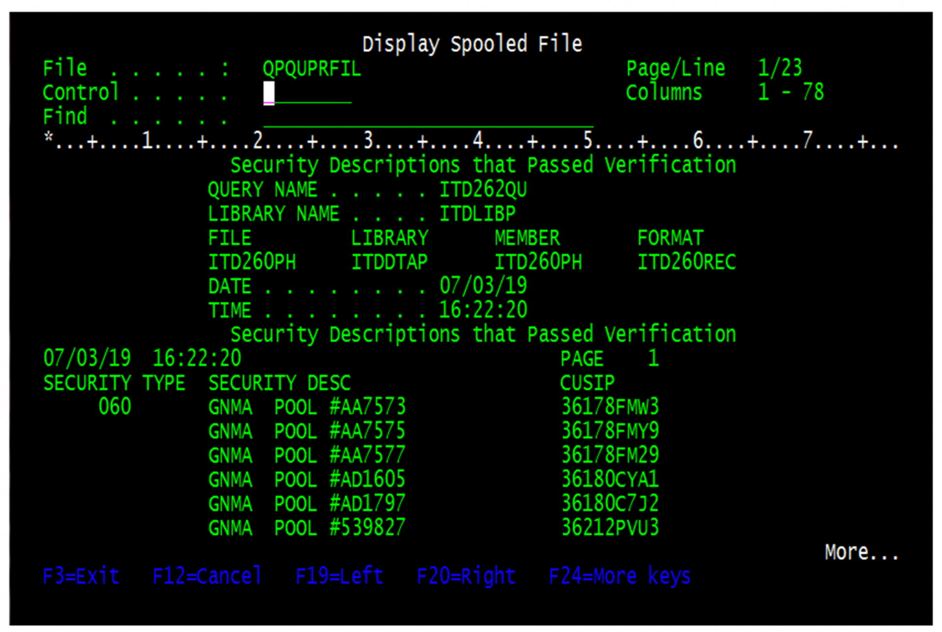
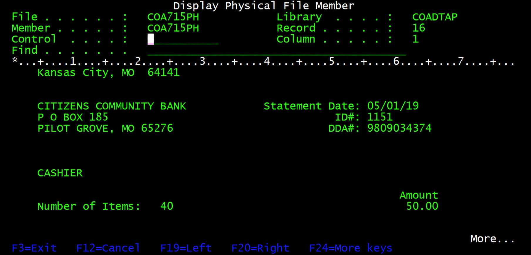
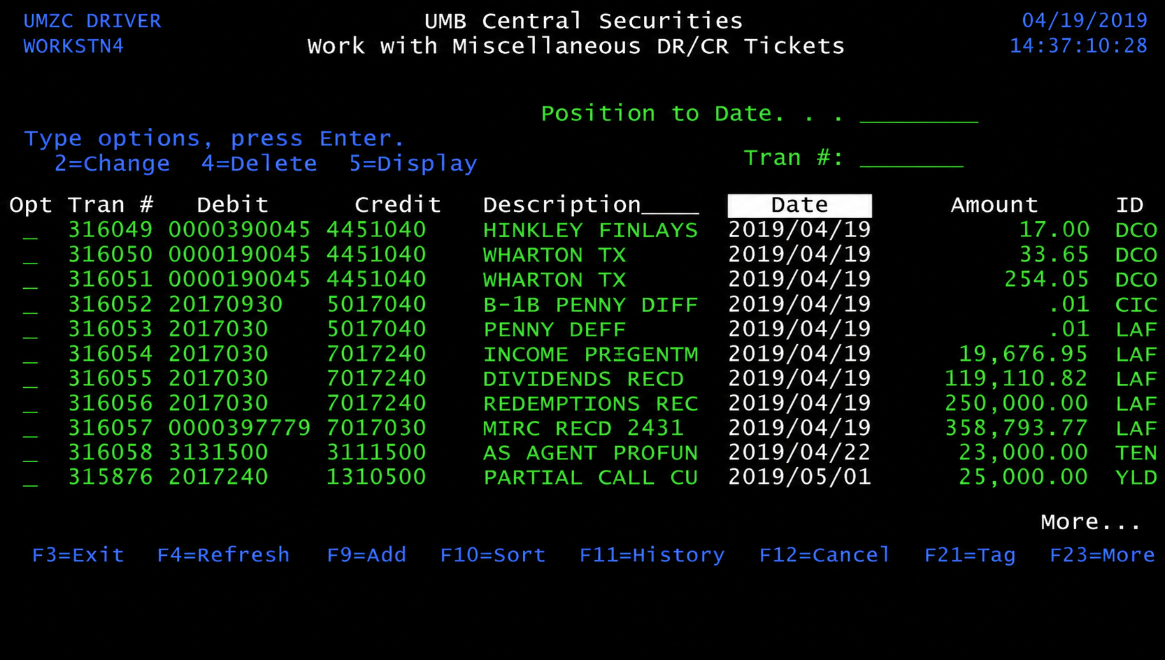
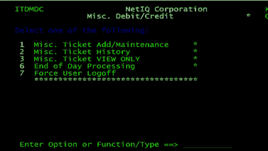
Their applications were running on DOS/AS400 — green-screen, command-line interfaces that employees with 30+ years of tenure had been using their entire careers. The challenge was designing an application for those internal financial investors which they could easily adopt while improving their efficiency in the process.
In this project I took the lead for discovery, research, interviews with SMS, design from scratch, working directly with the engineers, onsite moderated testing through delivery and presentation and finally delivering a successful adoption of the updated internal application.
Modernizing for clarity.
Built for
adoption.
Five siloed investment applications. All running on DOS/AS400. Users who had been entering commands in green-screen terminals for 30 years. The Representatives were fast with tabbing and key board short cuts hardly ever looking at the screen.
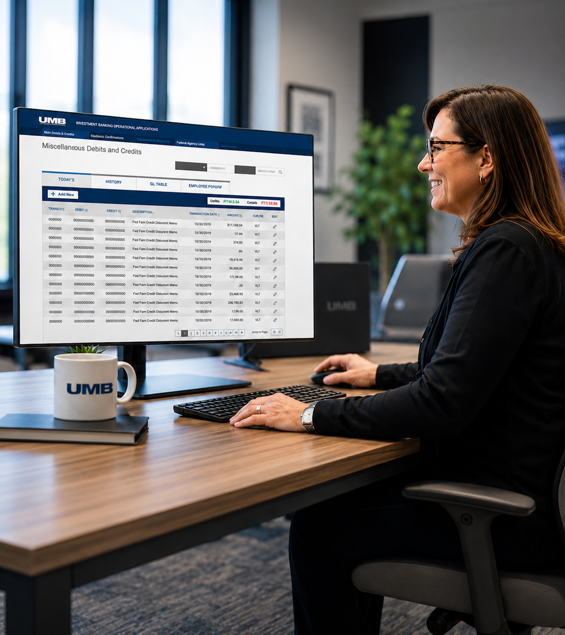
The applications they utilized covered miscellaneous debits and credits, change mode operations, ticket views and history, add/maintain workflows, and end-of-day processing — all critical financial operations where accuracy matters and errors can have critical consequences.
As the sole UX designer working as lead with a newly formed team of 8 developers, a technical lead, and a business analyst my first task was to provide a successful path for us to collaborate together for a successful on-time delivery. This included a Kick off meeting where it was established an acceptable ways of working including an agile sprint schedule and delivery that would be be agreed upon by every member of the team prior to engagement.
User Experience Transformation
Modernizing for clarity.
Built for
adoption.
Led the end-to-end redesign of UMB's Investment Banking Operations applications, replacing a legacy, green-screen experience with a modern, accessible, and scalable interface used across the enterprise.
Human-centered by design
Partnered with the users to understand the real workflows and pain points.
Streamlined complex workflows
Transcribed DOS tasks to digital interface with identifying and simplifying tasks, reducing time to completion, and improving accuracy and communications.
Accessible and globally usable
Bult to meet W CAG 2.1 AA standards for maximum usability
Driving adoption at scale
Designed for clarity and confidence, earning trust from expert users through in-depth reviews and live-training design.
Adoption & Change Management
The process of modernizing the UMB system was a matter of first understanding how the users performed their daily tasks and how to transfer their lengthy experience and ingrained patterns with an application that would deliver speedy results and satisfying experiences following adoption of the program.
1
Discover
Observed users and captured how they actually completed investment workflows. Produced personas and reviewed understanding.
2
Map Understanding
Mapping the tasks involved in performing the users work with a workflow. Performed micro-testing to ensure accurate 1:1 task to captured interface .
3
Translate in Design
Translated the validated workflows into designs that matched the cognitive and essential tasks. Feedback fueled design iterations.
4
Validate with Testing
Working interactive prototypes were tested onsite while users learned the benefits of adopting the newly designed mode of work application.
The employee personas revealed much.
The application modernization was much more than a redesign of an interface but the reimprinting of 30 years of patterns reimagined into an interface that would be welcomed not resisted.
Financial Advisor
Meets with multiple clients to assist in managing their finanical concerns.
Cares & Pain Points
Cares About
• Understanding client needs
• Promoting bank specials
• Meeting investment goals
• Accurate and fast reporting
Pain Points: Technical issues with software, outdated technical, financial downturns in the market

01
Financial Advisor
Investment Operations Manager
Responsible for accuracy of all reports in her division. Hands-on with daily data entry and processing.
Cares & Pain Points
Cares About
• Correct details
• Staying compliant
• On-time reporting
• Efficient processing response
Pain Points: Bad data, missing data, technical issues holding up operations

02
Investment Operations Manager
Director of Investor Operations
Focused on success of financial investors and client relationships. His agreement and support of modernization of the application was critical to success.
Cares & Pain Points
Cares:
• Financial end product success
• Efficiency in reporting
• Root-cause visibility
• Reliance on investment managers
Pain Points: Incomplete visibility into client relationships, Hard-to-spot-bottlenecks, Complex technology advances
03
Director of Investor Operations


Planning for Adoption with Cognitive Re-Patterning
Table Based Layouts
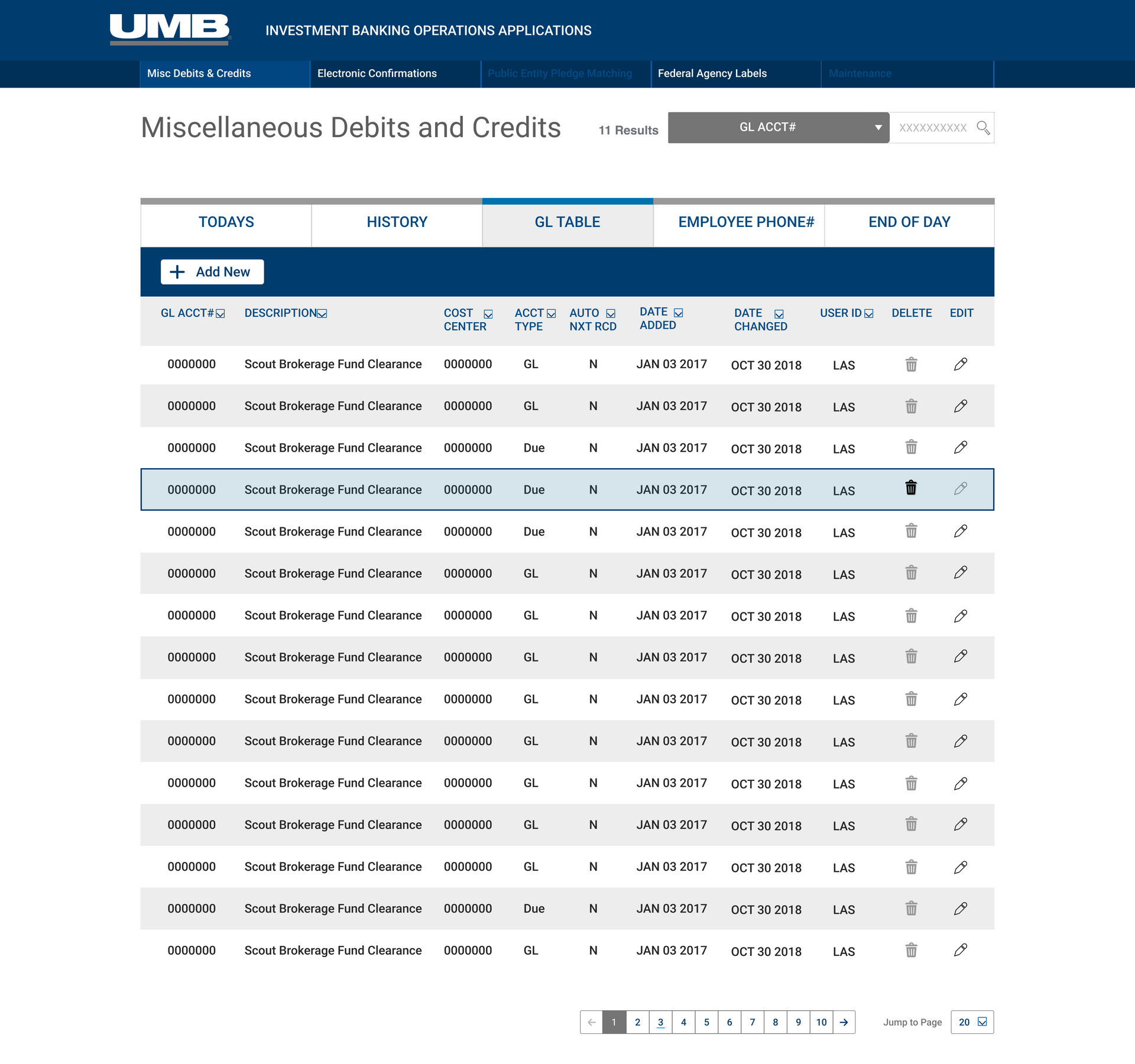
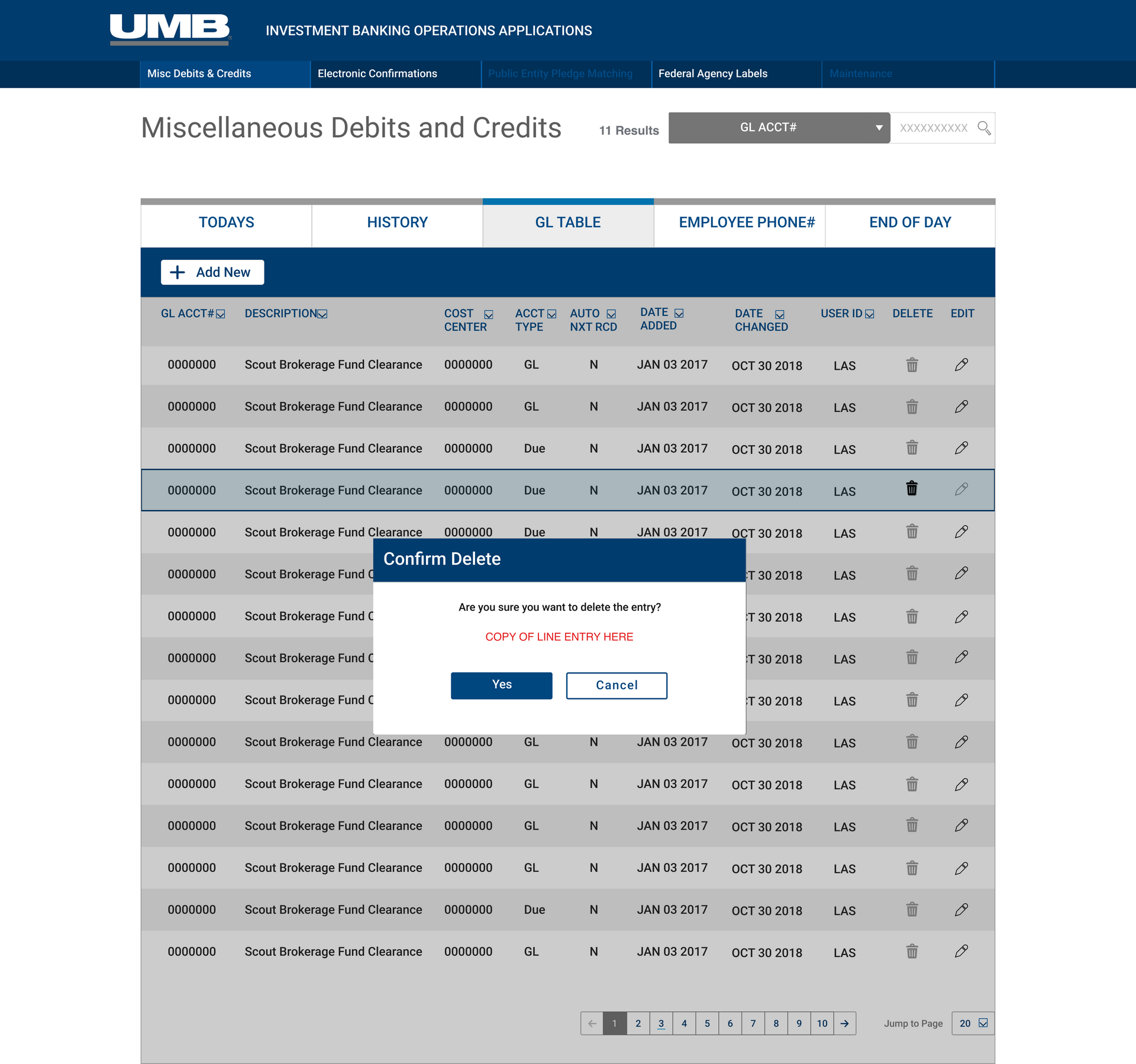
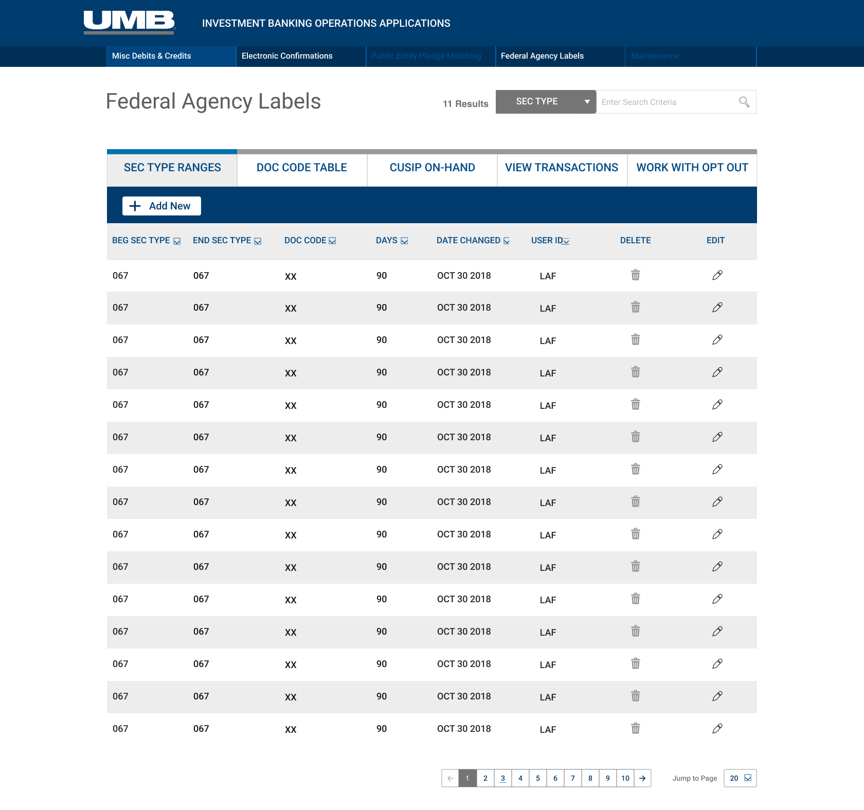
Preserved the data-dense DOS structure while creating modern table features such as sorting, filtering and search.
high contrast
Readability past accessibility requirements focused on larger font sizes, a limited high-contrast color palette and simpler navigation for ease of use and speed as well as reduced eye and brain fatigue.
Large click targets
To transition out users from DOS tab and enter user patterns ingrained for many years we provided analysis of the tasks to the the interface ineractions where users did not have to think to adopt the interface.
Deliberate Friction
What had been previously a task based click entry - an F4 or an enter+ click became a confirmation dialogue or other means to prevent errors visually.
inline editing
The interface I created for the users enabled them to easily perform all of their regular tasks from one screen with simplified model matching the DOS like mental model. It would be a very good first successful adoption to the modernized application.
Modernization was about the people who do the work
Users with thirty years of muscle memory don't adopt a new interface because it looks better. They adopt it because someone took the time to understand their workflows, preserved what worked, and made the transition feel safe. That is what user-centered design actually means in practice — not a research phase you check off, but a constraint you design against.
I also proactively led UX for a newly formed engineering-heavy environment where the team was still building its design practice. My contribution was turning user evidence into a delivery system: an architecture the business could recognize, interaction rules engineering could reuse, and an efficient path from design through code—meeting the team where it was while raising the quality bar.
From memorized commands to visible action
Users with thirty years of muscle memory only adopt a system that actually works for them to complete their dasily tasks. Adoption was planned into the design. The mission of discovery to understand their workflows and how they directly applied to efficiency in their business processes made the modernization transition a pull towards the better versus a push that was mandatory. By partnering with users and business throughout the design process we successfully delivered an adopted product with repeatable processes to impact effeciency to code by 30%.
Reusable styles & Processes
Leading UX I purposely moved to create repeatable processes replacing cyclical work with faster more on target deliverables. I transformed user tasks and feedback into a reusable delivery system: relaying the engineering design information through detailed screens and details on when, how, why and what the components were that formed the user interface paths.
A shared design language—before tokens
Figma variables and design tokens were not yet part of the team’s workflow. Sketch was the primary UX tool with Zeplin for hand off, so I created the structure we needed with symbols, shared text and layer styles, clearly documented interaction patterns, and a collaborative path from design intent to working code.
Primary Design Tool
Sketch
reusable foundation
Symbols & Shared Styles
Developer handoff
Zeplin + Working Sessions

Click by click patterns
Visual detail for every action
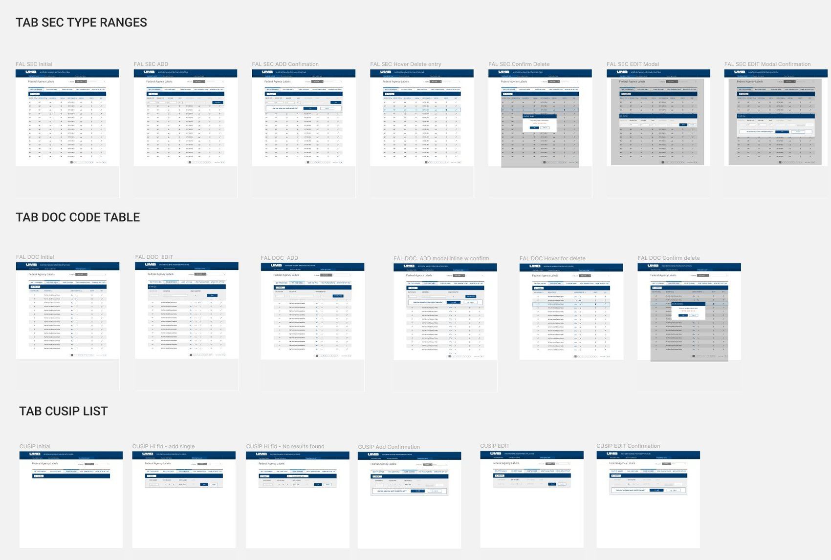
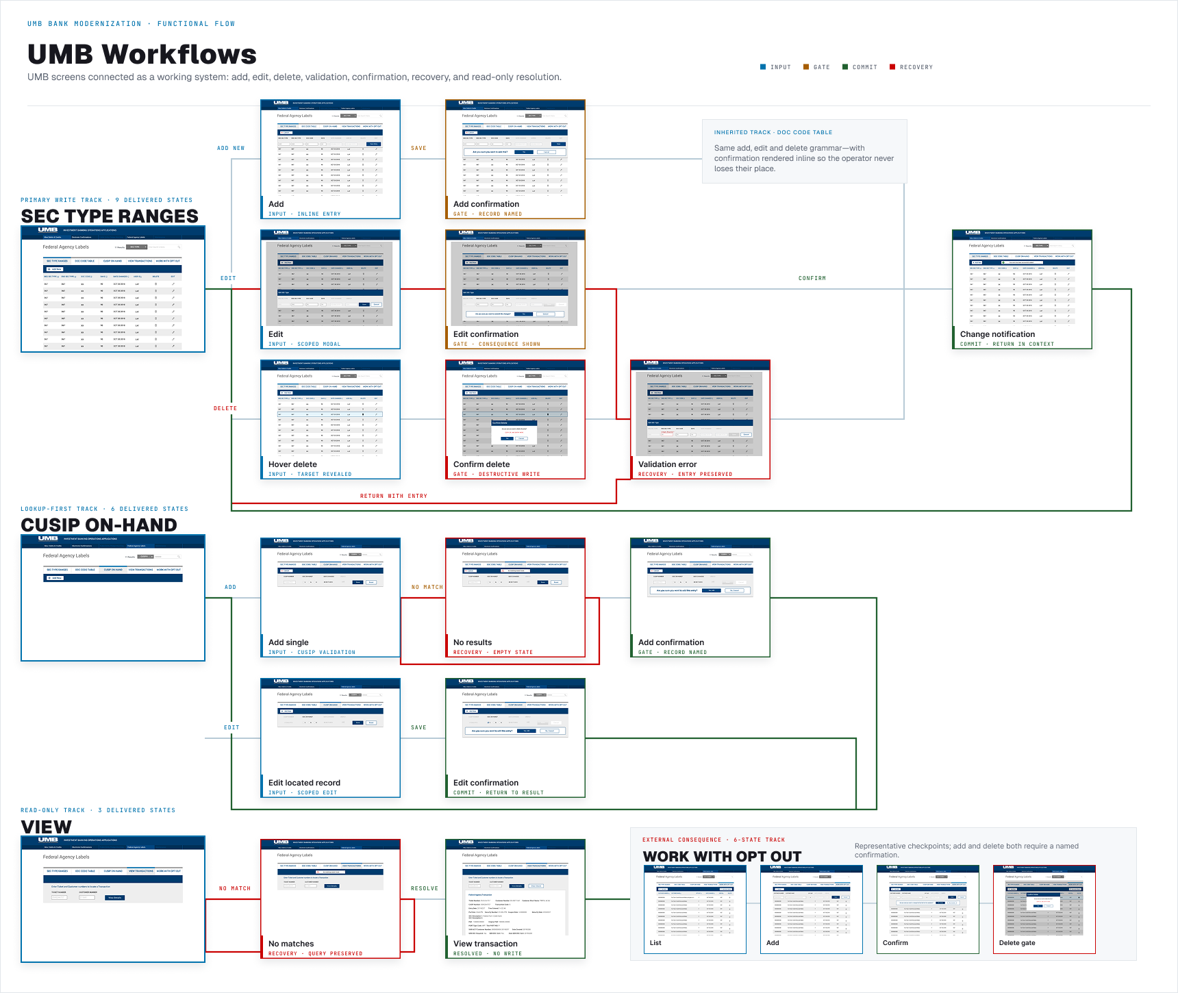
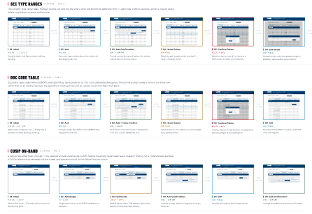
For each workflow, I laid out the screens in sequence so the engineering team could see the before, current state and what states followed for each interaction and for every component the potential use cases. The details were provided in screen detail along with conversations with the engineers assigned per feature - per sprint.
Reviewing in detail with engineers to ensure understanding, questions or missed cases.

Shared Branding
Functional Branding
Color's were labeled Primary, Secondary and organized by the job they performed—brand, navigation, neutral structure, and validation—so the team understood what each value communicated and where it belonged.
I reviewed branding gaps with stakeholders and resolved them prior to delivering to engineers. I provided a solid base foundation for the application and a consistent branding for UMB's future interface design scalability.
Notes were added on the delivery documents and the rest of was reviewed directly with engineers. It was thorough but manual process not nearly as efficient as what we do with Figma's integrated documentation today.
reusable interaction rules
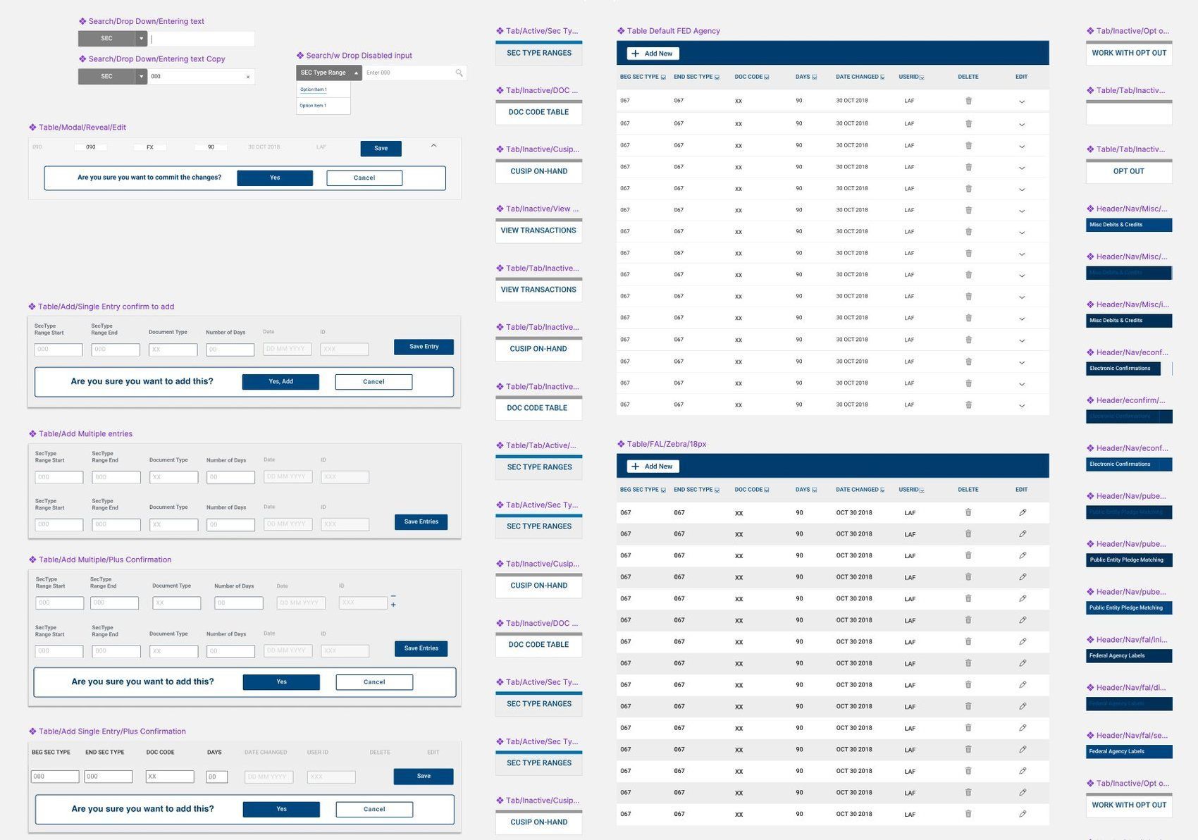
Symbols Detailed with focus states.
Reusable Master Sketch symbols for the tables, controls, confirmations, navigation, and editing patterns were documented for engineers and delivered via Zeplin. Each pattern provided what problem it solved, when it should appear, and how it behaved through the interaction.
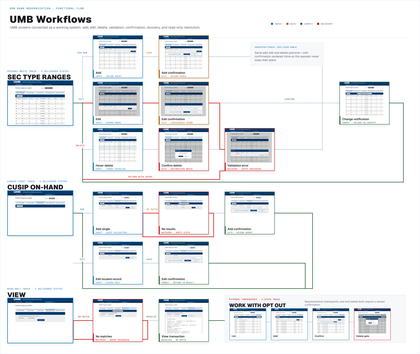
The screen-to-screen layouts documented what happened after every click—where validation appeared, when confirmation was necessary, and how investment operations specialists could recover from an error without losing context.

Symbol Components
Just like tokens they solve the task, decision, or feedback of the pattern it supports.
Business Need
Tasks that the user needs to perform in order to meet the business requirement.
Behavior
All of the modes such as active, inactive, edit, confirmation, validation, disabled, errors and recovery states.
Design to Engineering
Zeplin provided a way for developers to view and inspect design specifications. I met with the team to walk through design workflows where I explained design decisions connecting them with user feedback and business requirements . It was a more manual process than what we are blessed to have with Figma today but it gave us time to resolve questions and involve engineers for valuable insight before implementation.

01
Sketch source
Reusable symbols, shared styles, and named states created one working source.
02
Interaction flows
Screen-to-screen behavior made clicks, validation, errors, and recovery explicit.
03
Zeplin handoff
Developers received inspectable spacing, type, color, assets, and annotations.
04
Developer alignment
Working sessions confirmed intent, business rules, edge cases, and feasibility.
The best system possible
Detailed, communicated and thoughtfully executed
This was not a tokenized Figma design system. Figma was not yet the preferred software. This was a shared UI framework built in Sketch: a symbol library, reusable styles, documented behavior on screen flows and in Zeplin, complete interaction flows, and a collaborative path to delivered code. It reduced repeat decisions, improved consistency across the modernization, and gave design and engineering a common hands on language.
30%
improvement in design-to-development efficiency across the engagement
See what we have been working on to extend UMB into the agentic future of design!
We tested AI models, incorporated agents in compliance heavy interface, we modernized the visuals and crested a complete tokenzied scalable design system all with AI - and a little thought.
* Note: The UMB Extended AI case study you are about to see was for personal observation only and not a paid incorporation into UMB.